Wednesday, June 1, 2011

Journal 09: Coleman Project


Group Member's Blogs
           
            Our group started off by discussing who we thought our client, Coleman, was. We thought Coleman was adventurous, active, outdoor, fun, quality and durability, safety conscious, and spaceialy organized. From there we tried to establish a target market that Coleman hadn’t already marketed to.
            Kids and elderly people were two groups that we were really interested in developing a product for. From here we tried to think of problems that each of these groups had that we could come up with design solutions for. For example, kids need organization and safety while elderly people have trouble with strength, height, health, vision, and technology.
            After thinking of a few target markets we began to brainstorm some ideas we could possibly develop to help with these problems. A few ideas we came up with were some type of easy to use universal remote for all indoor products, an automated object to help reach things in high places, or furniture that could put itself together with plates and utensils already stored inside.
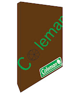
            We ended up thinking of an idea to make storage space more fun and interactive for students. The Coleman revolutionary desk features our organizational wheel. Once we came up with our idea we started to split up the work that needed to be done. Wade did many of the preliminary product drawings and final product drawings, Kelly made the PowerPoint presentation, Alicia was in charge of the kiosk drawing, and I designed the packaging and logo. Everyone did a great job getting their work done on time and communicating with the rest of the group. Overall, the project went really smoothly.
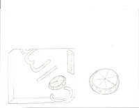
            Along with brainstorming with the group and making a few preliminary product sketches like the rest of the group, I was in charge of the packaging for our product and the new logo. I drew up a few preliminary packaging designs and after approval from the group began the final packaging. I think I helped out the group by having my part of the projects done on time, giving options the group could choose from, and helping anyone else that needed it.


Course Reflection 5

           During classes 17 and 18 we presented our Coleman for the Home products. Products ranged from my group's organization product, an eco-friendly lamp with whiteboards surrounding the base, to a treadmill with an interactive nature video game. It was interesting to see all the different products, packaging, and kiosk designs all the groups came up with. I was also surprised how talented the groups were with rendering their designs on the computer. Seeing what other people did also helped me to reflect on things I could have done better or differently in my own project.

Saturday, May 28, 2011

Journal 10: Final Thoughts on Course


          I really liked the Design 200 course overall. I think I learned a lot and built on previous knowledge. The way the class was formatted with lectures, guest speakers, videos, and projects didn’t allow the class to get boring for me. I especially liked the videos that were shown throughout the class and it made me more interested in design. I also liked the little tid bits about the design world that we were given such as different design programs, Prezi, and other events going on in the design world. I didn’t really dislike anything about the class to be honest.

Reading Reflection 04 - Chp. 9-10


Chapter 9
            Chapter nine focuses on the topic of Contexts. The first sentence states, “…three areas of contextual influence are relevant in to the design practice: the professional organization of design, or how designers view themselves; the business context in which a majority of design practice is located; and, in addition, the level of government policy…” Throughout the chapter the three contexts were explained more in depth and examples were given. One of the examples that stuck out to me the most was James Dyson’s vacuum. “Dyson has become a market leader in the United Kingdom” and has overcome companies such as Hoover and Electrolux. One of the most interesting quotes at the end of the Dyson example stated, “…big companies were once small companies with ambition.”


Chapter 10
            In chapter ten the future of design is focused on. Technology has already transformed design with all the different design programs and ability to create with such great detail. It’s exciting to think about where new technology and other developments will take design. The question of what a designer’s role would be was also brought up. For example, “…whether designers function as form-givers… or enablers.” The question of will the future products produced be determined by commercial companies or by users was also discussed.
            I liked the example the book gave about Fiskars and how they changed their product for the better with research on how the product was used so they could make it more safe and efficient.. They were so successful that they were able to expand to other product categories. I think other companies should follow Fiskars and try to design more for the user rather than being more concerned about money.

Sunday, May 22, 2011

Journal 08


I chose to focus on the legal issues in design because I feel it’s very important to protect the work that you put so much time and effort in. The lecture briefly touched on contracts, patents, trademark, copyright, and liability. The lecture in general caught my attention because I never really thought about the legal side of design and now that it’s been brought to my attention I realize how important it actually is.


“Intellectual Property”
            The AIGA website defines copyright as “a statutory protection granted to “original works of authorship.” This category includes everything from “published and unpublished fiction and non-fiction” to “drawings and other designs” to “musical performances captured on records, tapes, disks, ect.” to computer programs. It is important to know “titles, names short phrases, facts, anything written or created by the U.S. government and utilitarian works” are not protected by copyrights.
            I think this is a great source since AIGA is a well-known and credible source for designers. It also laid out what was and was not protected under copyright laws.
The article talks about copyright, notice registration, infringement, and fair use. It also discusses trademarks, registration, duration, infringement and trade dress.  


“Legal Issues: Intellectual Property”
            This article discusses more about designers working with clients and how they need to protect themselves in real world situations. The frequently asked questions section I found to be the most interesting. I like that the answers were to the point and easy to understand. Contracts were discussed and helpful hints of what should be included in a contract.


“Copyright Issues in Logo Design”
            The article “Copyright Issues in Logo Design” focuses on what the title states. It’s geared towards font design and copyright issues. For instance, “…we CAN NOT edit a font and sell it to a client as “mere lettering” for the font.” If you did you would be using characters from an already copyrighted font and it would then “exist separately from the typeface itself and therefore make it illegal to sell on as a derivative of the typeface.” Later on the article goes on to give tips on what you could to in order to no violate copyright laws.

http://www.dynamicgraphics.com/dgm/Article/28832/index.html

“Protect Your Legal Rights”
            The article starts off by talking about young designers and how many times they don’t have contracts with their clients. It grabbed my attention in the first sentence because no one wants to put in their time and effort to be ripped off in the end. I like that it was easy to understand and the legal terms that are used are explained fairly well.


“Design Rights, Legal Terms…Learn Everything”
            The beginning of the article discuses the fact that many graphic and web designers don’t pay too much attention to copyrights and legal terms, but it is very necessary. It proceeds to define terms such as copyright, disclaimer, copyleft, royalty-free and may others. The article also discusses the importance of contracts and what to do if someone is using your design. I like that a real world situation where design plagiarism happened. It was really interesting to see the possible design plagiarism in designs. I also found the section on photographing and legal rights to be interesting because prior to I hadn’t really found much about it on the other sites. 

Course Reflection 4


Class 13
            During class 13 we were introduced to the Coleman project. We met with our group for the first time to start brainstorming ideas for the product we would be creating for Coleman. We started off by defining how we viewed Coleman, existing products, and current users. From there we tried to come up with a target group and some problems they have that we could find solutions to.

Class 14
            In class 14 we were shown an example of a previous group's presentation. We also ran our ideas by our teacher to further refine our project. We talked about our product, targeted customers, what problems we were addressing, and why Coleman would be addressing this need. We also began sketches for our product.

Class 15
            Our group continued to work on sketches for our product and fix design issues we had. We began our PowerPoint during class 15 along with kiosk ideas.

Class 16
            We had our last group meeting in class. We finished our product sketches and continued to work on our kiosk and packaging. At the end of class we set up a time for our last meeting outside of class where we would tie up lose ends before our presentation Monday.

Sunday, May 15, 2011

Reading Reflection 03 - Chapter 1-6


Chapter 1
       The way of thinking that "...is focused on making a product and getting it to a customer quickly and cheaply without considering much else" is hurting our environment and us. Companies should be a little more worried on the bigger picture rather than trying to make a quick buck, since these products, that they most likely use too, will end up hurting them in the long run. 
       So many of the products today are designed for use during a short amount of time so new products would have to be bought. Another issue with the way products are designed to the “one size fits all” standard. For example the book talks about the design of detergents. Makers of detergent just add more chemicals so that in any circumstance the detergent will work.


Chapter 2
           “Recycling is like an aspirin, alleviating a rather large collective hangover… overconsumption.”
The scariest thing I think was that chemicals found in our plastics today and other products have endocrine disrupters that “appear to mimic hormones and connect with receptors in humans and other organisms.” Research has focused on these chemicals causing cancer, but little is known yet about all the other effects they could be having.
            I also was unaware that products to be made from the things we recycle have a lower quality because many of the things we recycle were not made to be used over and over again.
 

Chapter 3
            Eco-effectiveness was the topic in the third chapter and a topic that designers should take heavily into consideration. “…eco-effectiveness means working on the right things- on the right products and services and systems- instead of making the wrong things less bad.”
            I really liked the cherry tree analogy. Cherry trees create fruit for many organisms to eat; their fruit and blossoms decompose once on the ground and eventually turn to nutrients for other organisms and soil. If only humans could design products like the cherry tree where nothing is going to waste.


Chapter 4
            The first thing that grabbed my attention in the fourth chapter was when the authors talk about early on in different cultures people worked with nature instead of against it and how this has drastically changed. For example, the Nile River would overflow each year and leave a rich layer of silt after it receded to help fertilize crops. In 1971 the Aswan High Dam was built and the river no longer has a chance to flood and fertilize the surrounding area.
            “In addition to biological wastes, people began to pour all kinds of things down the drain: cans of paint, harsh chemicals to unclog pipes, bleach, paint thinners, nail-polish removers.” I can’t imagine how many chemicals and toxins are in our water thanks to all of the things we pour down the drain thinking were disposing of it. Of course if products were designed in a way the book talks about, so that everything can be disposed of or recycled properly we wouldn’t have that problem.

Chapter 5
"The vitality of ecosystems depends on relationships: what goes on between species, their uses and exchanges of materials and energy in a given place." I think all designers need to take this into consideration when designing. If products could be made to work with the ecosystem rather than against it the environment would be much better off. Not all ecosystems are similar and what may work in one may not be the best solution in another ecosystem.

Chapter 6
             My favorite part of chapter five was the beginning where the Ford River Rouge plant was discussed. The factory began their "disassembly" line during the Depression where workers would strip each car of it's products. The factory became so large that it overtook hundreds of acres, but over the years the facilities started to age and became outdated. Much of the factory became unused and because of this the company had the opportunity to incorporate eco-effective thinking. Rather than abandoning the factory and starting new somewhere else they chose to make their factory better by using eco-effectiveness. They used green plants to remove toxins and other harmful things coming from the plant in the soil. They also wanted to have a green roof and parking lot that could absorb and maintain storm water, among the many other things they did to make the plant eco-effective. I think it's great to read about real life situations where eco-effectiveness is being used. Hopefully in the future we continue to move towards this type of design and continue to better our environment.

Wednesday, May 11, 2011

Journal 07: Peer Dialogue


Alicia L

            Her letterform assignment pictures were so creative and unique. It was really cool where she found her letters. I really liked E and A. I also found her three possible home good products interesting because they seem like something you wouldn’t normally see in a traditional home they’re more out of the box designs. I completely agree with Alicia’s statement, “I found C2C to be energizing and I could relate/involve myself in McDonough’s writings.” Once I started reading I couldn’t put the book down because it got me interested in the topic and kept me interested throughout. She also mentions reading Design: A Very Short Introduction and becoming bored with the book. I have to agree, at the beginning I was really into learning more about design, but as the book went on it just lost my interest.

Kelly B

            Kelly mentions the Design Circle presentation in her course reflection. I also took the same things from the presentation, learning more about each program and the advice to JUST DO IT! regarding the entrance exam. I think the presentation helped to motivate me a little more in my endeavors to get into the design program. She also found the Design: A Very Short Introduction to be lacking in the department of holding your attention but was a fan of the Cradle to Cradle book. I found the section of the video Rip! A Remix Manifesto interesting when “Brazil broke medical patents on HIV/AIDs that defied United States international property laws in order to make a cheaper medicine that could benefit a lot more people,” as Kelly says. I can’t believe that we’re more interested in protecting our ideas and money than we are about helping save others lives.

Sunday, May 8, 2011

Assignment 04: Letterforms

"Q"

"U"


"n"

"H"

"C"

"O"

"I"


"L"

"M"

"V"

"X"

"Y"

Journal 06: Online Scavenger Hunt

Retailers specializing in outdoor camping and recreation products:
REI
Gander Mountain
Bass Pro Shop
Dick's Sporting Goods
Cabela's

Trade Show/ Exhibition booths from outdoor recreation and sporting industry:
SIA snowsports trade show
OutDoor trade show in Germany


ISPO sporting goods and sports fashion trade show


Working Definition: An indoor home good is a product someone uses inside their home to make activities more efficient or make the space more aesthetically pleasing.

Retailers specializing in indoor home products:
Homegoods
Ikea
Pier 1 Imports
Bed Bath & Beyond
Crate & Barrel

Trade Show/ Exhibition booths from the indoor home goods market:
Kitchen & Bath Show
NeoCon furniture trade show
Building & Interior Trade Show


Images of home good products:


Bedding
Lighting
Furniture

Friday, May 6, 2011

Course Reflection 3


            One of the topics discussed during class nine was color. Having had a color theory class before helped me to better understand this lecture. I thought the most interesting thing that had to do with our color lecture was the associations and moods that go with certain colors. For instance, blue is viewed as peaceful and calming whereas red is viewed as power, anger, and danger just to name a few. It’s so cool that just by changing a color you can change someone’s mood or their associations to colors.
            Later we talked about some of the business and legal issues dealt with in design. I think everything discussed was really important because it’s not something I would think about just being a college student, but once we get into the real world were going to need to know how to protect our ideas and designs.
            We also began to watch Brett Gaylor’s video, “Rip!: A Remix Manifesto,” during class nine.

           We continued watching “Rip!: A Remix Manifesto” during class ten. The video brings up the idea that culture builds upon itself, but it’s hard to build upon it because so many things are copyrighted or legally protected. The main character the video focuses on is the music mash-up artist Girl Talk. Being a fan of Girl Talk myself, I found the video entertaining. I never really thought about the artist violating the law for his music, but Girl Talk would owe around $4,200,000 to clear just one album legally.
            I couldn’t believe that the legal rights of the song Happy Birthday where owned by the company Warner/Chappell and any one that sings it without paying royalties to the company are basically in violation of the law.


            During class eleven we had a few students from Design Circle come talk to our class. They spoke about what design circle is, their experience in the design program, some of their projects, and the entrance exam. I’m glad they showed some of the projects they had done because it gave a more in depth look at what each design major is all about.
            The most helpful section of their presentation was when they discussed the entrance exam. It was really helpful to get other students opinions and tips that had been through the process of applying before.


            Class tweleve was about the design firm Cobego. Three graduates of the university who helped start the firm came to speak to us. Listening to people that graduated from the program and talking about what they’re now doing with everything they’ve learned makes all the hard work worth it.
            It was reassuring to hear that if you don’t get in the first time not to totally give up on the program because there is still a good chance you’ll be accepted the second time around.

Monday, May 2, 2011

Reading Reflection 02 - Chp. 7-8 & Intro

Chp. 7
            Chapter seven of “Design: A Very Short Introduction” discusses identity. I guess I should of expected with all the branding in our society that even countries would be interested in branding themselves, but it almost shocked me when I read about it in this chapter. “Among the most bizarre features of the United Kingdom as the twentieth century faded were proposals to ‘rebrand’ the national image, of how the country was viewed by foreigners, in terms of a more up-to-date concept of ‘Cool Britannia” (Haskett 86).
            I also found the section on discussing cultural differences and how they affect design interesting. For example, the appliance company Whirlpool had to evolve it’s designs to adapt to different markets throughout the world. “With a lightweight ‘world washer’ introduced in 1992, it was necessary to accommodate washing 18-foot-long saris without tangling in India, and to add a soak cycle for Brazil to cater for the local belief that only pre-soaking can yield a really clean wash” (Haskett 89).

Chp. 8
            “A system can be regarded as a group of interacting, interrelated, or interdependent elements that forms, or can be considered to form, a collective entity” (Haskett 97). Imagine having to find your way around a subway station and subway route without having any signs, maps, pictures, or anything else to guide you. I’d imagine that would be pretty difficult. This chapter gives transportation as one example for its need for systems. In order to get around using a subway, signage and type need to be used in a way that users can understand. They need this to find their way to the appropriate place in order to use the subway efficiently.
            I liked how the last paragraph tied into the “Cradle to Cradle” introduction regarding design and the environment. The last paragraph discusses the need for “greater compatibility between the artificial systems generated by human creativity and the systems of the biological world…”(Haskett 111). It later goes on to mention that if we could begin to understand how systems can affect each other and how certain parts of the system effect the whole, we could use design as a solution for the harmful effects these systems have.

Intro
            The intro of William McDonough’s & Michael Braungart’s “Cradle to Cradle” have interested me a great deal. This book has been one of the most interesting books I’ve been assigned to read throughout college. It’s brought up a topic that I don’t usually give too much thought to, but after reading just a small amount of the book it has really persuaded me that environmental design is truly important for the sake of our future.
            In no time at all the book brings up the severity of the effect of today’s products on the environment. I knew society was seriously effecting the environment, but I had no idea to what extent. “Let’s take a closer look. First, that comfortable chair you are sitting on. Did you know that the fabric contains mutagenic materials, heavy metals, dangerous chemicals, and dyes that are often labeled hazardous by regulators – except when they are presented and sold to a customer? As you shift in your seat, particles of the fabric abrade and are taken up by your nose, mouth, and lungs, hazardous materials and all” (McDonough 3).
          Why are customers not warned about the hazardous materials in many of the objects we use day to day? Before this book I had never heard about the amount of dangerous materials probably put into the chairs I use everyday along with the abrasion of these particles just by using the chair. I would personally like to know about these materials that could be affecting my health.

Wednesday, April 27, 2011

Journal 05: Peer Dialogue


            After reading Alicia’s course reflection, I started to notice we both found a lot of the same things to be interesting the past few classes. I also enjoyed the hot wheels video because it gave a glimpse into how design could potentially help the disabled. I was excited after seeing this video and I can’t imagine the excitement of someone with disabilities after seeing the possibilities of this type of design. I liked that Alicia took a different direction and found faces within industrial designs, even if she didn’t do it on purpose. I especially liked the face found within the steering wheel. Also, it was interesting to read about the Wieden & Kennedy firm since they have made many ads for popular companies such as Coca Cola and Nike. Alicia mentions that one of the lectures in class made her change her mind about what major she wants to pursue. I am also starting to rethink which of the three design majors I really want to pursue.
            After looking at Kelly’s found faces, I really liked the faces found on the elevator and Math Tower. It’s amazing how many faces can be found in everyday life. When reading her response to the assigned readings, I realized we had a lot of the same reactions, especially when she said “I never realized until taking this class that my life, and the lives of others is encompassed in design.” I completely agree with her, I guess it was a little naive of me not to realize this sooner. I found her research on designers to be the most interesting, mostly because I’d either never heard of them or knew little about them. For example, prior to reading her post I’d never heard of Brandever or Stefanie Schwarz. I really liked the designs shown on the wine bottles that she posted. The abstraction and creativity of the labels drew me in. Then I read about the graphic designer, Stefanie Schwarz. The examples of work Kelly posted were so interesting and colorful. I look forward to finding out more information on Schwarz.
            I think reading other student’s blogs is really helpful and educational. Without this assignment I would not have known about many of the designers and design firms the students posted about. It’s really increased my interest in design as a whole.

Saturday, April 23, 2011

Course Reflection 2


            During the fifth class the design process was the topic. We talked about the methodologies and processes, which can be linear, cyclical, or branching. Then an overview of the design process was discussed, which includes problem definition & constraint, research, the design cycle, production, and evaluation & review.
            I found the link on the blog from the fifth class interesting and funny because I always heard not to use comic sans, but never really knew why. After reading it, it seemed so obvious why and kind of comical that I never realized how much I've used the font inappropriately.
            Prior to our class about design for accessibility, I never really gave much thought to how much designers can help disabled people. Some of the statistics were shocking, 28 million people had difficulty walking a quarter mile and climbing 10 stairs according to the 2000 census. Also, 18 million people reported having difficulty carrying a 10-pound bag of groceries or grasping small objects. According to the Americans with Disabilities Act, reasonable accommodations should be available to all. A section of their act states, “Provide equally effective access to programs and services to individuals with disabilities in an integrated manner.” Further into the discussion Hopkins Hall was discussed regarding it’s accessibility for the disabled. It would be very difficult for someone with disabilities that has never been to the building before to figure out how to get in. The wheelchair ramp is on the opposite side of the building in comparison to the parking lot and the elevator isn’t much easier to find.
            Later the topic of universal design was discussed. “Universal design is a theory that states products, services, and environments should be designed to include a broader range of the population including those with varying disabilities.” I found the Good Grips products to be one of the most interesting examples discussed. I’ve seen the Good Grips products many places and actually own some myself, but little did I know why they were designed in the first place. The designer’s wife was having issues using a can opener due to some loss of ability to use her hands. Instead of just opening the cans for her he decided to invent something to help her and soon after came the Good Grips products.
            During the seventh class the scavenger hunt for assignment number three was the main focus.
            Out of these four classes I found the class on environmental design the most intriguing. I think environmental design is especially relevant today and designers should be especially focused on it. Environmental design promotes sustainability, designing for the needs of today without compromising the future, and is design that is environmentally friendly. A great example of an environmental design is Grolsch’s beer bottles. The top seal and glass are both recyclable. By making the whole bottle recyclable they are reducing their amount of waste. Some other examples of environmental design we were shown were the recyclable Aeron Chair, 135 mpg Tesla Roadster, and chocolates with edible packaging.
            During this class we were also shown a few videos involving environmental design. My favorite video was on Michael Pritchard’s Life Saver water filter. It was amazing to watch such filthy water be filtered into safe drinking water. With $8 billion the amount of people without safe drinking water could be cut in half and with $20 billion everyone could have access to safe drinking water. To put this in perspective Pritchard gives us the amount of money the English Government spent on foreign aid the past year, $12 billion. I think if we used our money a bit wiser and had the help of designers, such as Pritchard, we could solve many of the world’s major problems.

Assignment 03

The method I used to go about finding the buildings and chairs for the scavenger hunt was by researching on the internet. For most of the clues I was able to type in the name of the designer or chair and then "at OSU" to find a link that gave me the answer I needed. I also did some research online to find my interesting facts about the chairs and buildings. From there I went out to each place and took my pictures.


The Barcelona Chair was designed by Ludwig Mies van der Rohe. The chair was originally made to furnish Van Der Rohe's German Pavilion at the International Exhibition in Barcelona. It was designed to serve as seating for the king and queen of Spain, while the stool, which is no shown in this picture, was intended to accommodate their attendants. Design Within Reach
The chair in this picture is Eero Aarnio's Pastil chair. The Pastil chair was designed in1967 and in 1968 the chair was awarded the Industrial Design award. The New York Times wrote about the Pastil Chair and The Ball Chair, one of Aarnio's other designs, "the most comfortable forms to hold up the human body." The magazine I am reading is the April 2011 issue of Metal Architecture. The article was about lighting up your space.
Pastil Chair

In the picture is the Wexner Center which was opened in 1989 and designed by Peter Eisenman, the first major public building he designed. Eisenman's design was driven by the overlapping grids of Columbus's street plan and our campus. The building is set between these two different grids. The Wexner Center was named in honor of  Leslie Wexner's, Chairman and CEO of Limited Brands and donor to the Wexner Center, father.
Mimoa
Wexner Center
Wexner Center History


Designed by Philip Johnson the Mathematics Tower is shown in this photo. I found the four arches on the the building's face to be a really interesting detail. They draw the eye upward to the top of the building, along with across the building's face due to the curvilinear lines.


The Thompson Library was designed by local architects Acock & Associates. The building was actually built in three different stages: "the original, a Second Italian Renaissance Revival Style Structure opened in 1913; a 14 level stacks tower with wings and pavilions completed in 1951; and a modernist addition to the west, completed in 1977."  
Acock & Associates


Group Members:
Alicia L's Blog
Kelly B's Blog


Sunday, April 17, 2011

Assignment 2


                                            Dale Chihuly (shorter post)
Fiori di Como


            As my aesthetics of appearance professor was talking about the different expressive qualities of line, a video was shown that focused on an artist that specializes in creating pieces with blown glass. I realized that I had definitely seen some of his work before, but never gave a second thought about it or who the artist was. As she showed more and more of his projects I became interested in finding out more about the artist and his work. Luckily, we were assigned this project and I was able to do so.
Neodymium Chandelier
            Dale Chihuly was born September 20 in Tacoma, Washington to George and Viola Chihuly. Unfortunately, Dale had somewhat of a tough childhood. At sixteen Dale lost his older brother, George, and soon after at seventeen he lost his father, Dale. He attended a wide array of colleges and universities. From starting out at the College of Puget Sound to transferring to the University of Washington, to receive his B.A. in interior design and architecture. He then attended the University of Wisconsin to receive his M.S. in Sculpture, to attending the Rhode Island School of Design (RISD) where he received his Master in Fine Arts. Dale chose to teach at RISD for eleven years and he established their glass program.
Joslyn Window
            In 1961, Dale learned to melt and fuse glass and after this his career started to take off. Only three years later, in 1964, Dale “receives the Seattle Weavers Guild Award for innovative use of glass and fiber” and is “awarded highest honors from the American Institute of Interior Designers” a year later. His first environmental installation was installed in Pilchuck in 1971. From then on his portfolio of work continues to grow and grow.
            While in England in 1976, a car accident leaves Dale with 258 stitches in his face and loss of sight in his left eye. As if this wasn’t bad enough for the artist, about three years later he was in a bodysurfing accident where he dislocates his shoulder and then gives up his position of being in charge of production of his projects. Although he has given up his position his work has been quite successful and beautiful. He has had installations in many different parts of the world like the White House, Las Vegas, London, Venice and many others.
            After looking more in depth at Dale Chihuly’s work he has really become one of my favorite artists. It’s amazing what he is able to create with glass and the difficulties he had to overcome is really inspirational.

                                          Works Cited
“Chronology.” Dale Chihuly. n.p. n.d. Web. 12 Apr. 2011.              
            <http://www.chihuly.com/>. 

Chihuly, Dale, et al. Chiuhly Projects. Seattle: Portland Press, 2000. Print.


Michael Graves (shorter post)
            Michael Graves is a name many people have probably heard but may not know too much about, including myself. I’ve heard the name numerous times, but never knew much about him besides that he designed products for Target. I chose to pick him as one of my designers so I could learn a little more about him and so I would be able to put some information to the name.            
            Michael Graves was born in 1934 in Indianapolis, Indiana. He attended the University of Cincinnati and later Harvard University’s graduate school of design. He also went to the American Academy of Rome to study.  He later began teaching at Princeton University in 1962 and stayed to teach architecture for over 25 years. In 1964 he founded the Michael Graves & Associates in Princeton, NJ and since the opening of his company he has designed over 350 buildings worldwide along with more than 2,000 products for various companies.
Conical Kettle
            Michael Graves’s designs for Alessi are probably the most well known. He designed the conical kettle with birds in 1985. In an interview he had with the New York Times, Graves talks about why he used certain colors for the Alessi Kettle. He said, “Blue is cool, so you’re supposed to think that it’s not hot. And the bird is red: you’re supposed to think to be careful to remove the bird.” The phrase “function before form” has come up many times throughout our class and readings so far, his quote seemed to fit right in. As simple as the thinking behind the design was, I personally think that was a great part because he focused on the function of the kettle.
The Dolphin Hotel
            To focus more on his architecture, a few buildings Graves is well known for include “the Public Services Building in Portland, Oregon (1982), the library in San Juan Capistrano, California (1983), the Humana Corporation headquarters in Louisville (1982-86), the Dolphin Hotel in Disney World, Florida (1989), and the annex to the Whitney Museum of Art in New York (1989-90).” I was surprised to read that he was a part of designing the Dolphin Hotel in Disney World, Florida having stayed there before. I thought the hotel was massive, beautiful and I was really intrigued by the architecture. This just goes to show me that design is truly all around me in my everyday life. 

                                      Works Cited
“ALESSI – Kettle 9093 Michael Graves NEW Blue or Black For Sale.” 
            Photograph.Collectibles-Articles.com. n.d. Web. 15 Apr. 2011. 
            <http://www.collectibles-articles.com/>.

Ben Mangor. “Walt Disney World, Dolphin Hotel, Orlando, Florida USA.” 
            Photograph. Super Stock. n.d. Web. 15 Apr. 2011. 
            <http://www.superstock.com/>.
 

“Michael Graves.” Art Directory. n.p. n.d. Web. 12 Apr. 2011.
            <http://www.art-directory.info/>.

“Michael Graves Biography.” Target. n.d. Web. 12 Apr. 2011.             
            <http://pressroom.target.com/>.

“Michael Graves.” Kettererkunst. n.d. 12 Apr. 2011.              
            <http://www.kettererkunst.com/>.

Rima Suqi. “Michael Graves on Objects He Designs for Target, and Himself.”
            Home & Garden. The New York Times. 30 Mar. 2011. Web. 12 Apr. 2011.
            <http://www.nytimes.com/>.


Paul Rand  (longer post)
            Another designer I have heard the name of and knew just the basics about is Paul Rand. I’ve learned just a few things about Rand from a previous design class and the current design course I’m in. I wanted to learn a little more about the graphic designer since that is the area I’m interested in getting a degree in.
            Paul Rand was born in Brooklyn, NY in 1914 as Peretz Rosenbaum. He was educated at the Pratt Institute, Parsons School of Design, and the Art Students League.  He later went on to teach at Cooper Union, the Pratt Institute, and Yale University.
            As stated in the Graphic Design Archive Online, Paul Rand’s career can be divided into three sections. “From 1937-1941, he worked in media promotion and book design; from 1941-1954, he focused more on advertising design; and from 1954 on, he began to concentrate on corporate identity programs.”
            His first designs were for his father’s grocery store and his school’s events. He began his career creating stock images that were supplied to newspapers and magazines. Around this time was when Paul decided to change his name from Peretz Rosenbaum to Paul Rand to avoid the Jewish identity given by his name. “Peter Behrens notes the importance of this new title: ‘Rand’s new persona, which served as the brand name for his many accomplishments, was the first corporate identity he created, and it may also eventually prove to be the most enduring.’”  By his early twenties Rand was already gaining international attention. Even before he was such a well-known designer he was branding himself. I think you have to be a pretty intelligent person that knows exactly what you want to do what Paul Rand had.
            Rand was chosen for the job of setting the page layout for an anniversary issue for the Apparel Arts in 1936. After doing such great work with this job he was given a full-time position along with an offer as art director of Esquire-Coronet magazines. At first Rand didn’t believe he had evolved the level of skill needed to accept the job, but soon after at twenty-three years old he decided to take the position. It's truly unbelievable the amount of work Paul Rand did by the early age of twenty-three and how much skill he already possessed.
            Rand’s corporate identity that gained him the most notoriety was the IBM logo he designed in 1956. He then modified the logo in 1960 and later in 1972 to the popular striped logo. Louis Danziger gave much credibility to Paul Rand when he said, “he almost singlehandedly convinced business that design was an effective tool. […] Anyone designing in the 1950s and 1960s owed much to Rand, who largely made it possible for us to work. He more than anyone else made the profession reputable. We went from being commercial artists to being graphic designers largely on his merits.” Paul Rand designed logos for Westinghouse, UPS, and ABC to name a few. His designs were rumored to reach $100,000 each in the ‘80s and 90’s. He also helped to establish the Swiss Style of design.
             I really enjoy the simplicity of many of Paul Rand’s designs like the ABC and UPS logos. He doesn’t feel the need to make his work look busy to give it the feeling of importance. In an interview with John Maeda, one of Paul’s students and friends, Paul is asked “what are the fundamental skills of a designer and he responded by saying the fundamental skill is talent.” Paul definitely has the talent he talks about in this interview. I find him to be an extremely creative person, especially because sometimes making a very simplistic design is harder to make than a complex one. Unfortunately, Paul Rand is no longer with us as he passed away from cancer in 1996. His work continues to influence designers and people everywhere.
 

Paul Rand's logos for ABC television, IBM, UPS, and Ford
     
                                                Works Cited
“Original Mad Men: Paul Rand & Saul Bass.” The Dapper Dude. Photograph. 
            20 July. Web. 15 Apr. 2011. <http://thedapperdude.com/>.
 

“Paul Rand: A Brief Biography.” Paul-Rand.com. n.p.  n.d. Web. 12 Apr. 2011.                   
            <http://www.paul-rand.com/>.

“Paul Rand.” Graphic Design Archive Online. RIT Libraries. n.d. Web. 12 Apr.  
            2011. <http://library.rit.edu/>.

“Thoughts On Design: Maeda @ Media, Interview excerpt with John Maeda.” 
               Paul-Rand.com. n.p. n.d. Web. 12 Apr. 2011. 
               <http://www.paul-rand.com/>.